


1
AR + Social + Guerrilla Campaign: Cool Cats

9
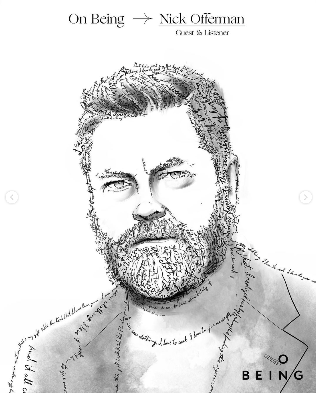
Social Content: OnBeing

4
Product Concept & Launch: Emotional Support Beer

9
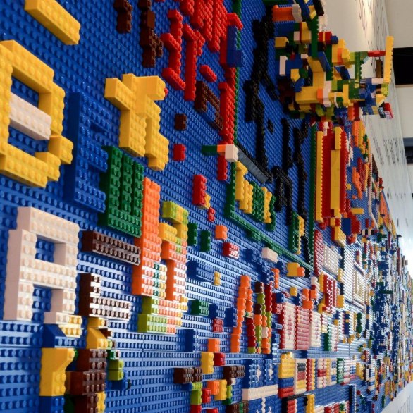
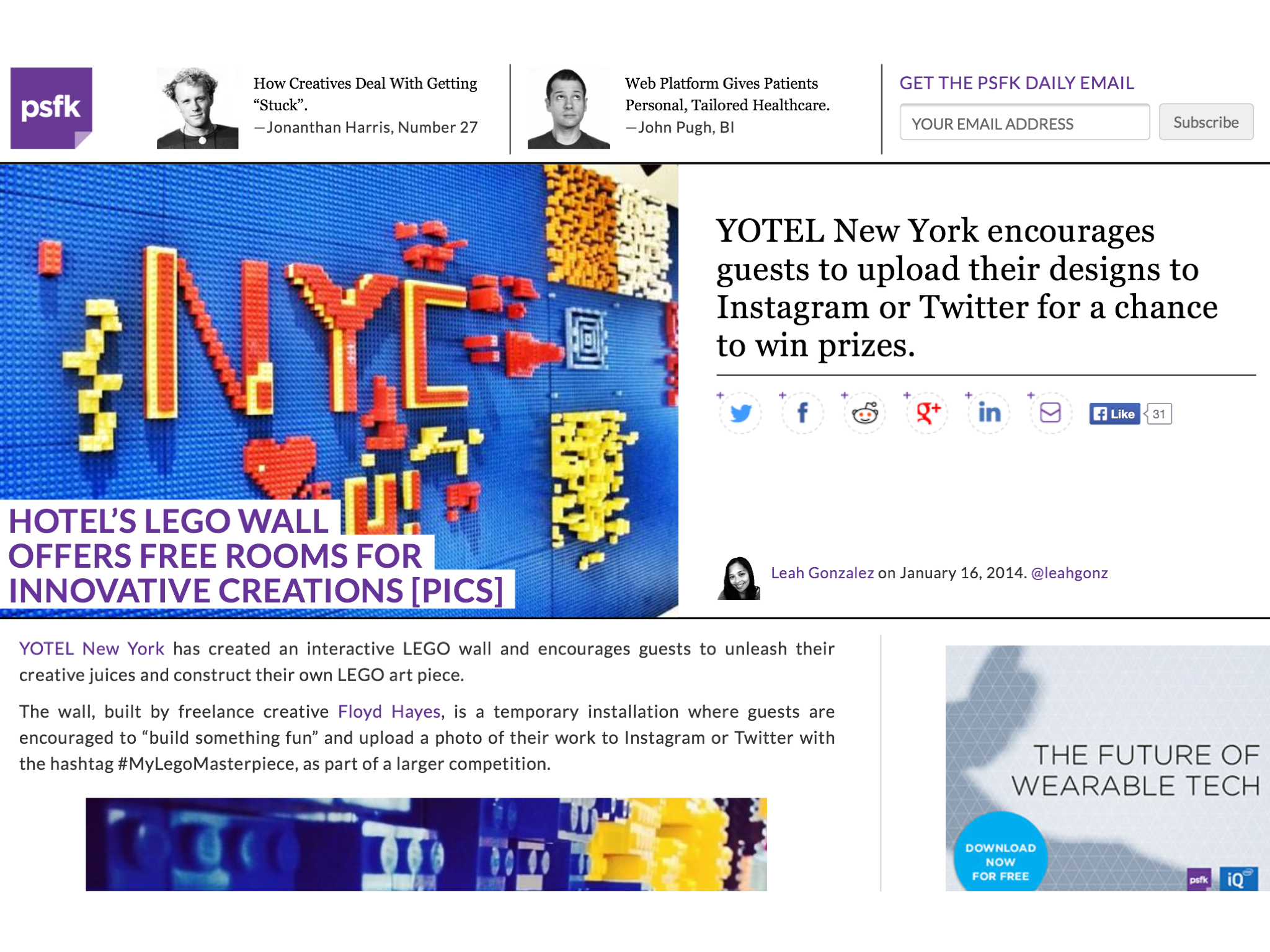
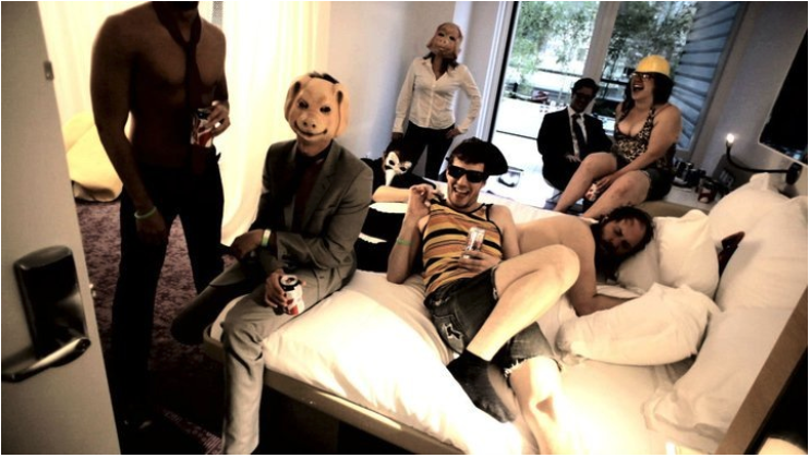
Experiential Social Media: Yotel Installation

2
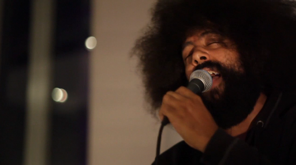
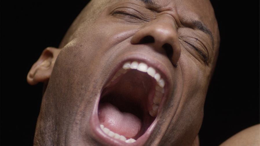
Content Video: Yotel Yawn

3
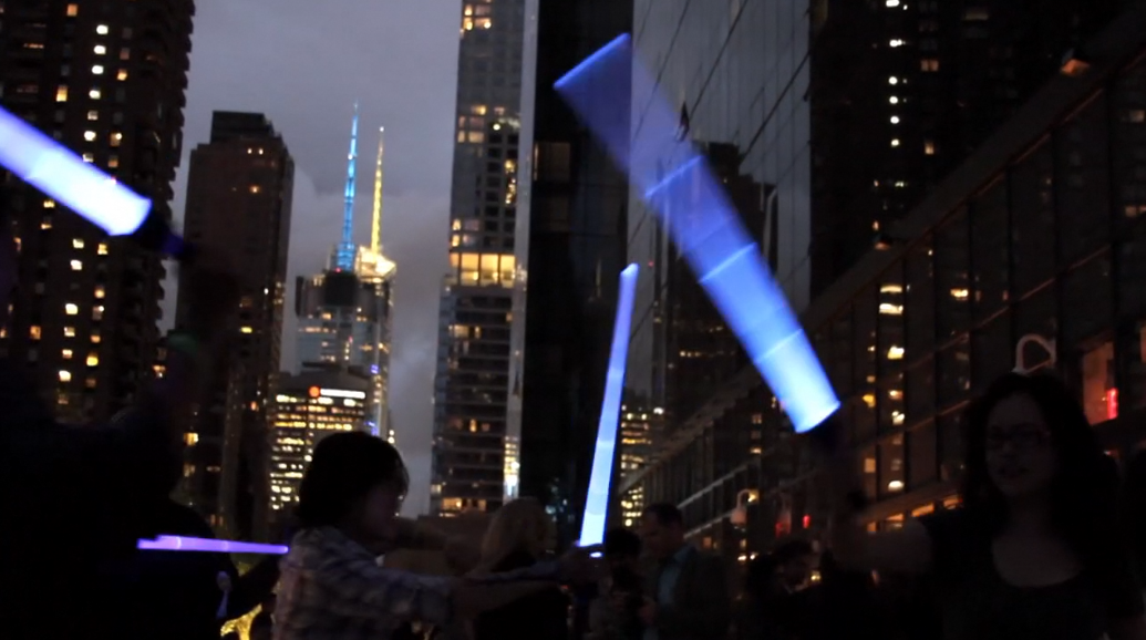
360 Launch Campaign: Yotel Hotel

1
TV Commercial: Ford

2
Real World Gaming: Alfa Romeo 4C

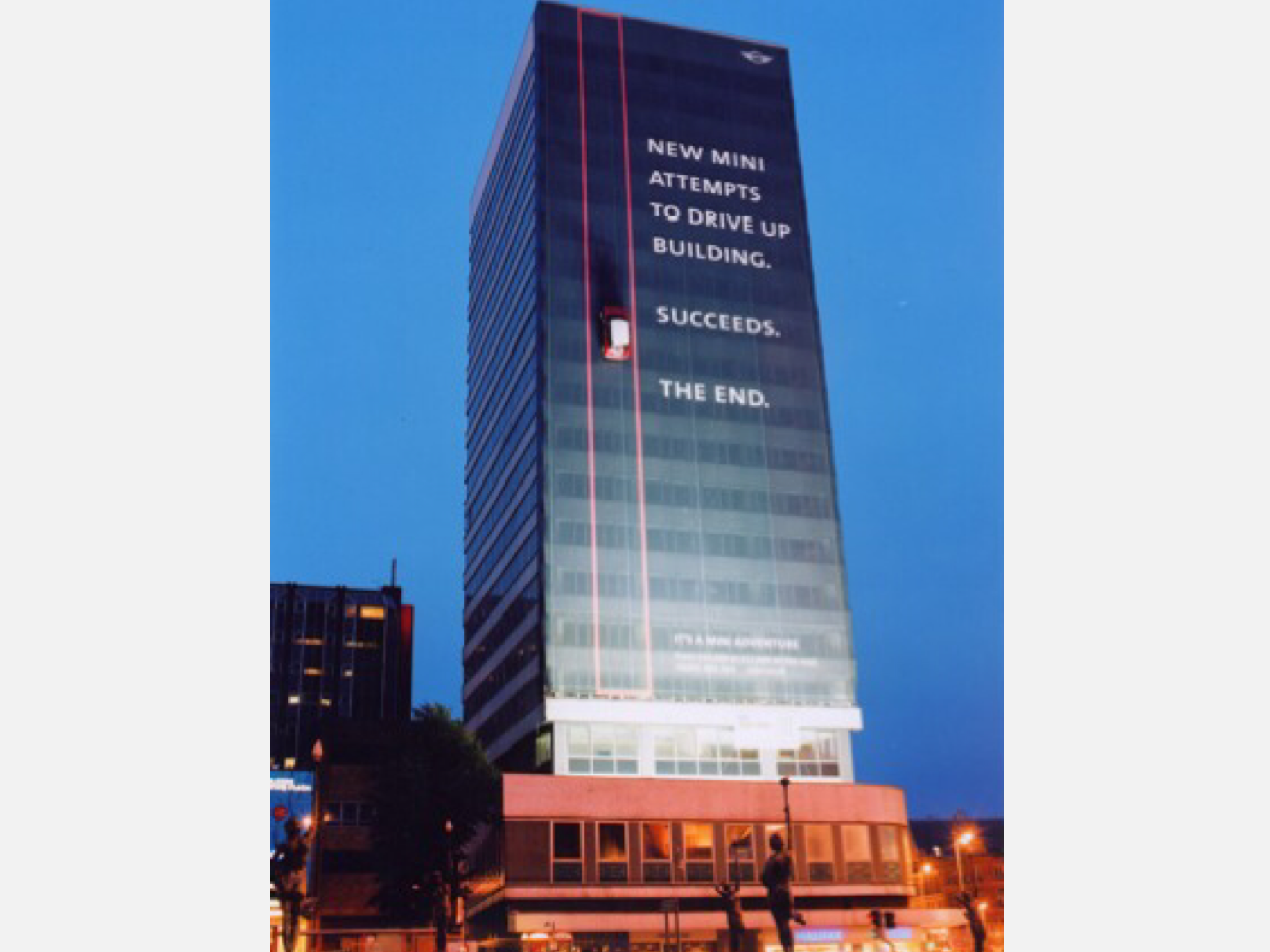
10
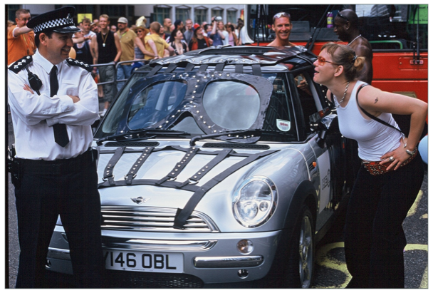
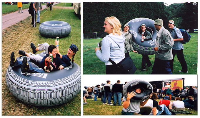
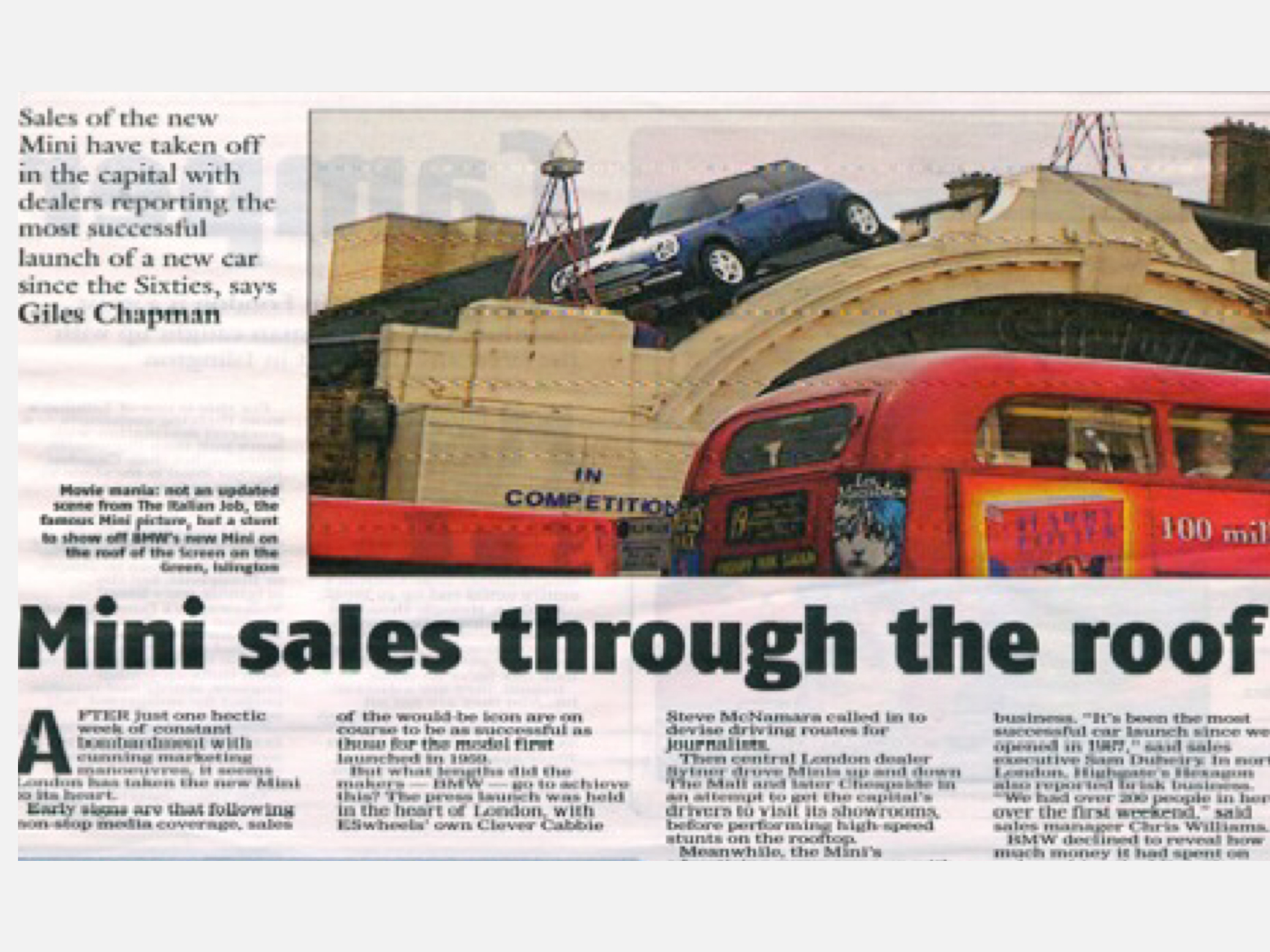
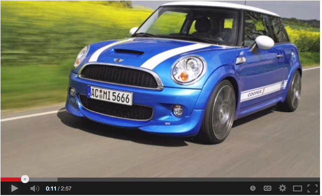
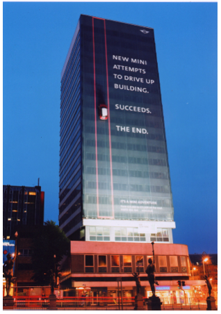
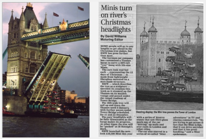
Campaign: Mini Cooper

12
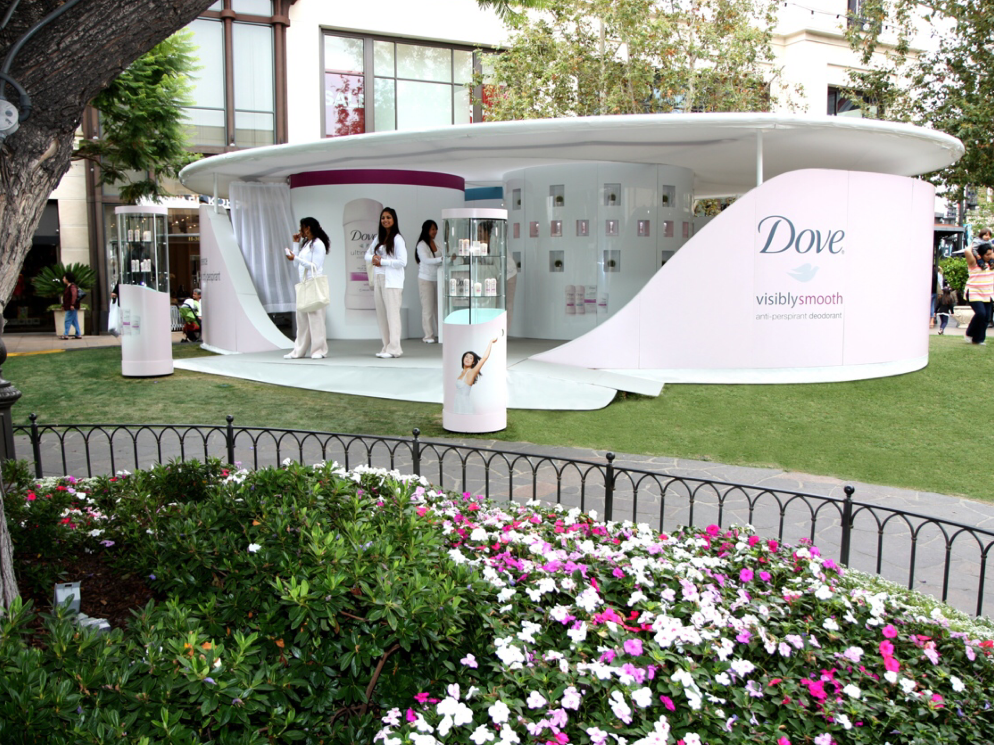
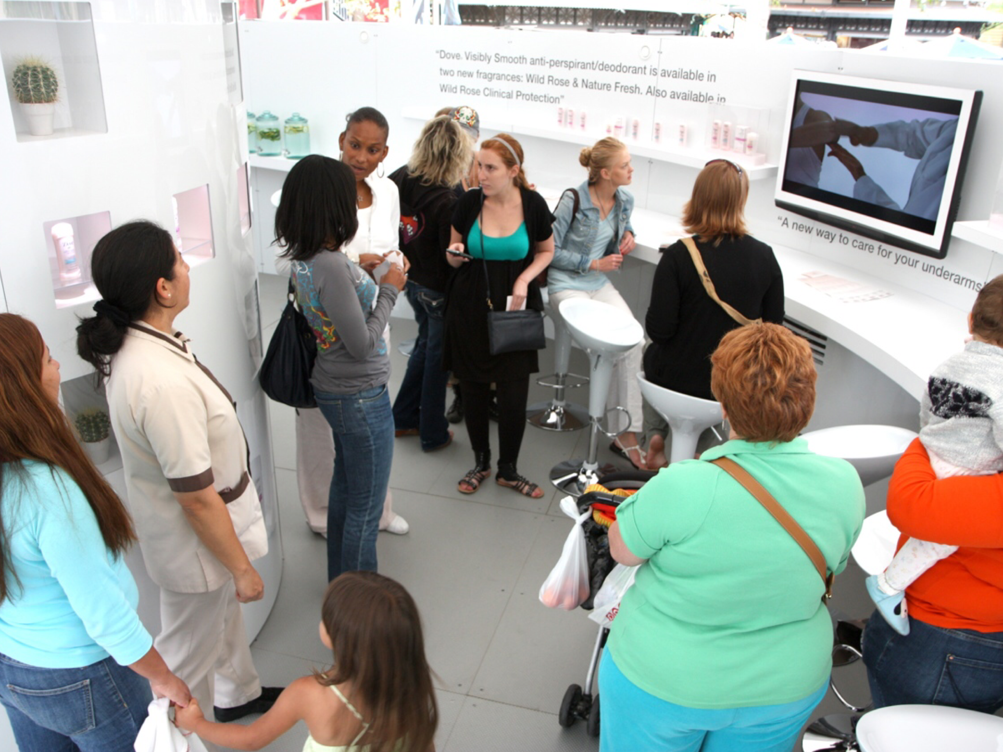
Integrated Launch Campaign: Dove

3
Live Digital Experience: HSBC

2
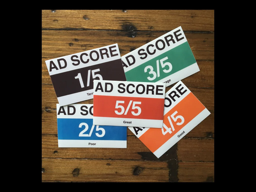
Guerrilla Product: Ad Score Stickers

5
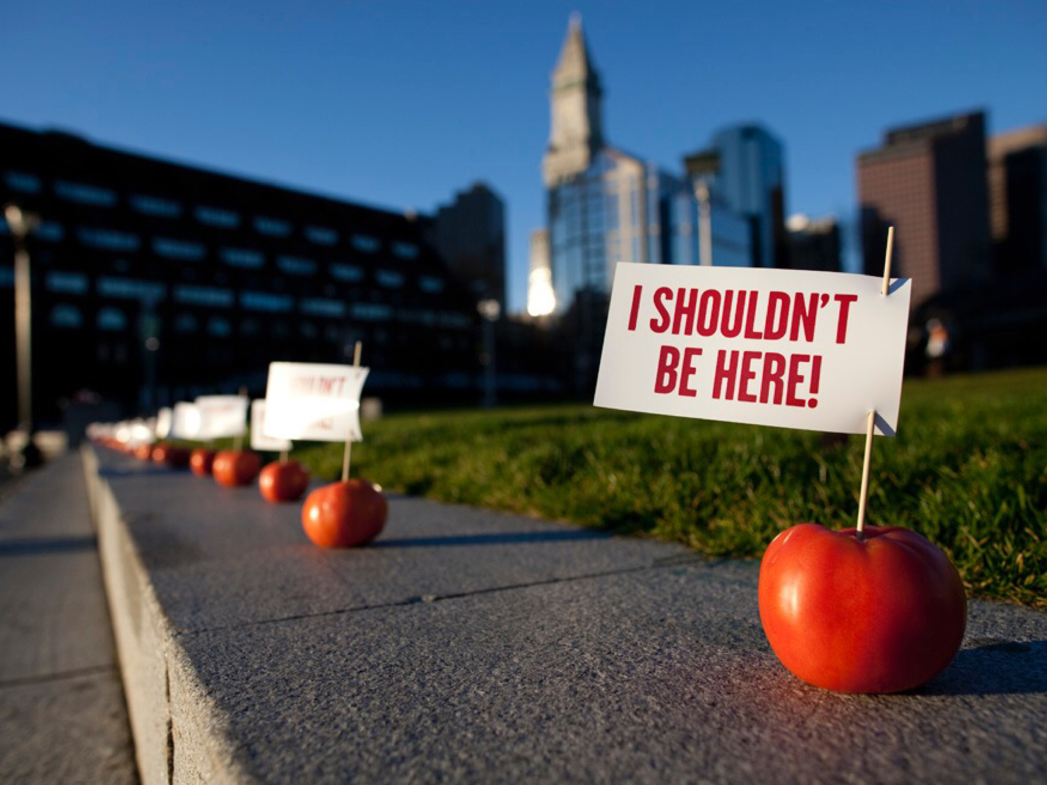
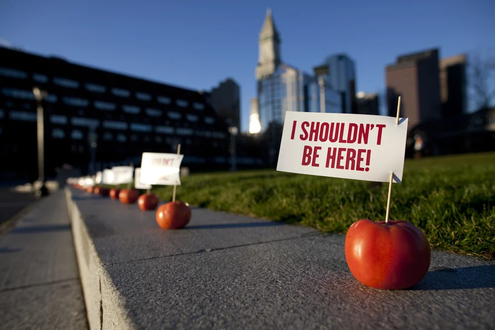
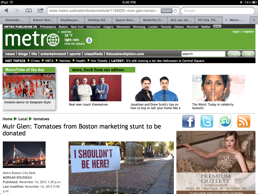
Guerrilla Stunt: Muir Glen Organic Tomatoes

4
Guerrilla: SyFy

3
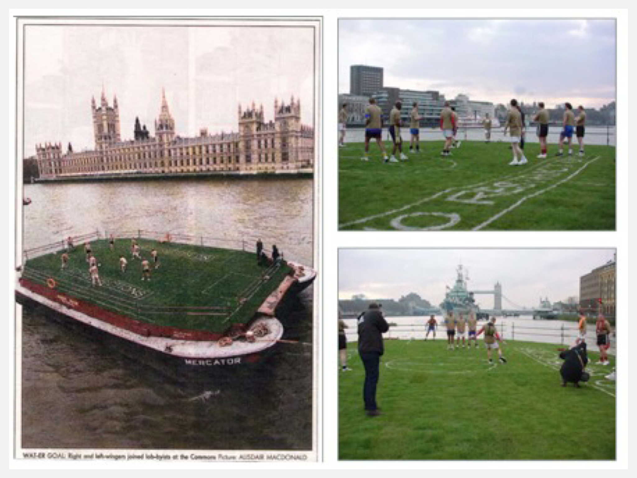
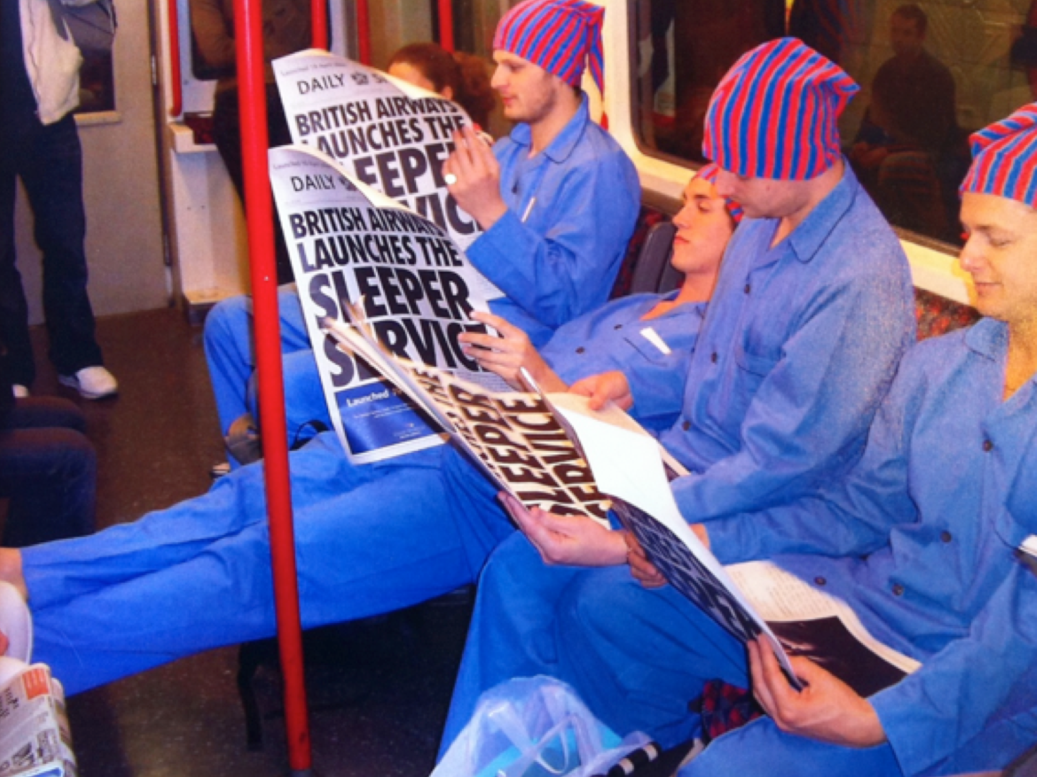
Live Theatre/Experiential: British Airways

5
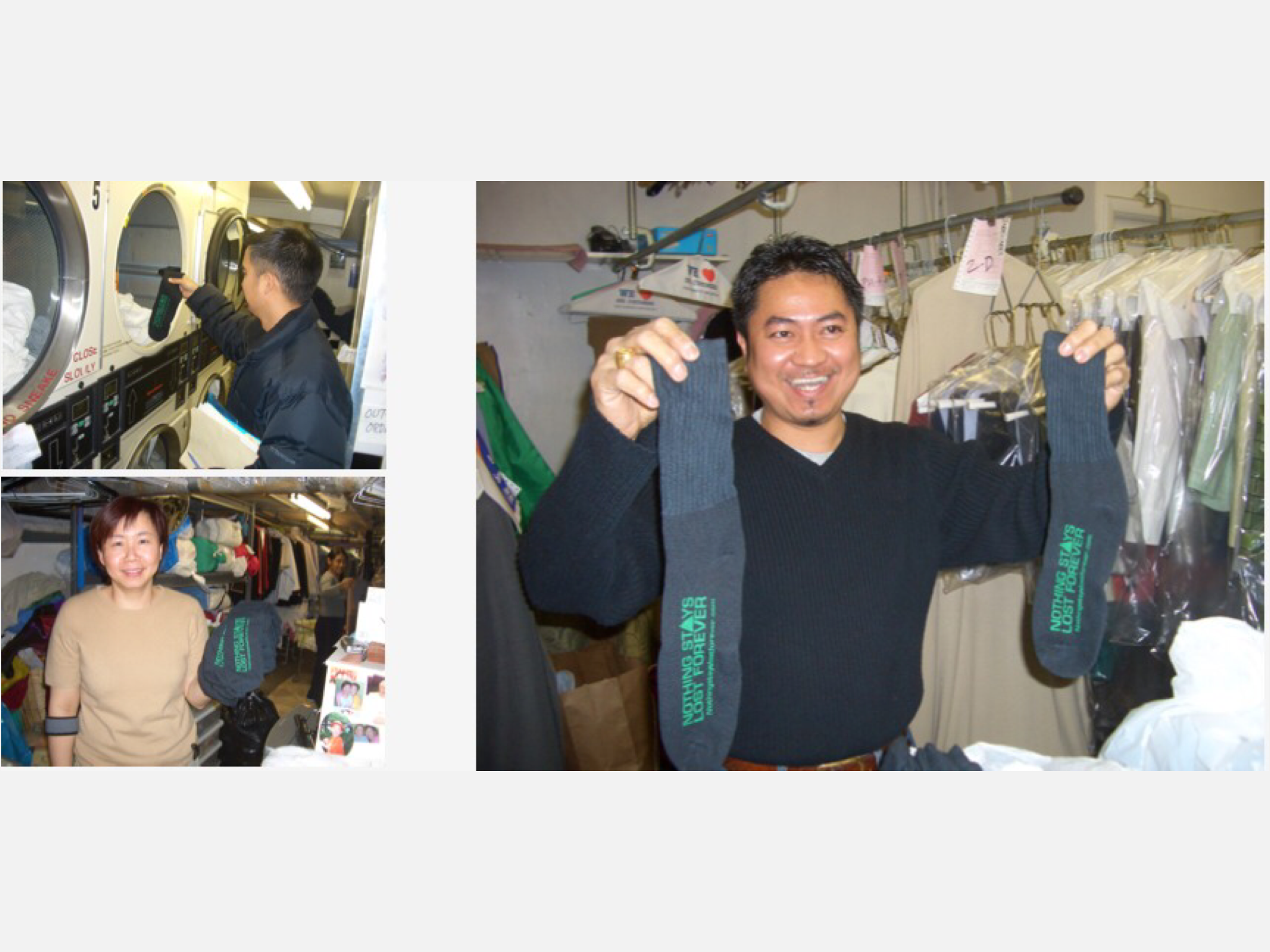
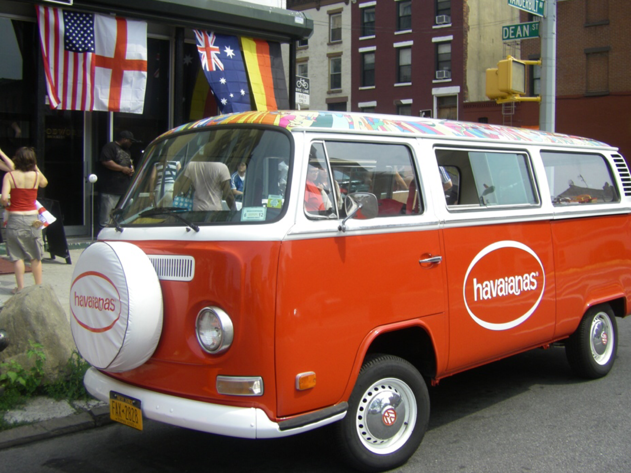
The Man Who Sold Brooklyn

7
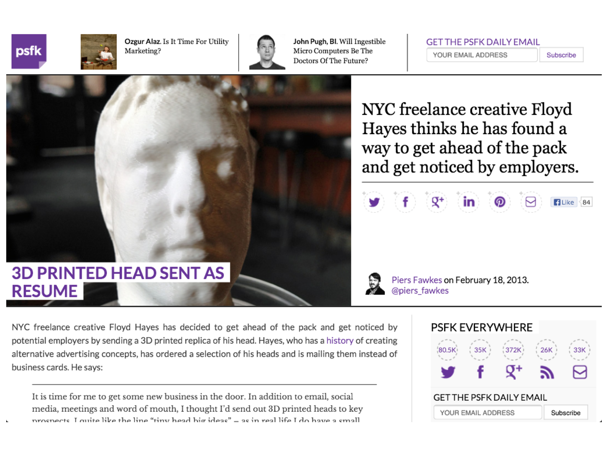
B2B: World's First 3D Printed Resume

7
"Top 100 Brilliant Businesses" Entrepreneur Magazine
1
Online Training: Guerrilla Marketing School

5
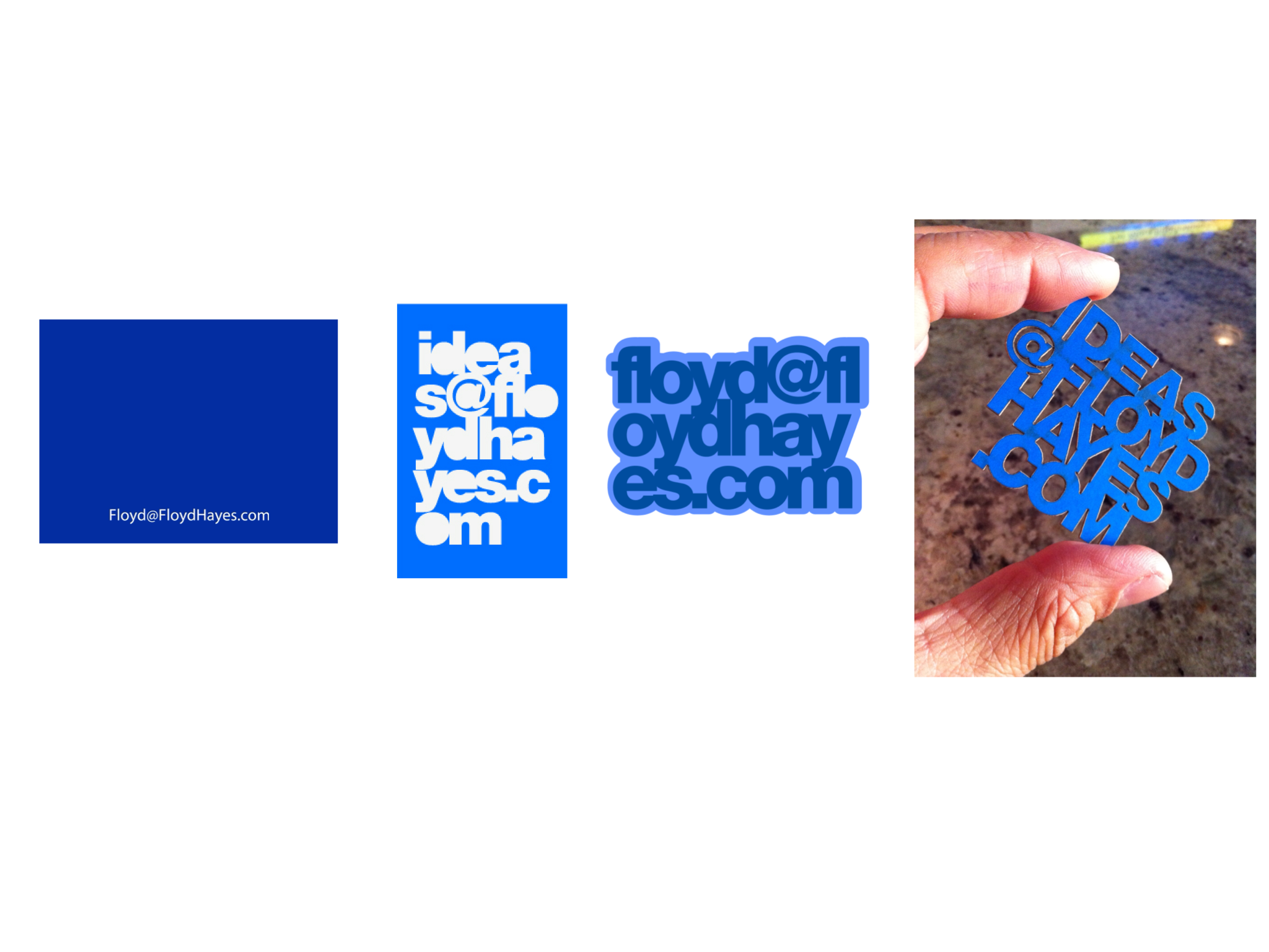
B2B: Business Cards

5
Product Design & Development: Seksi Spam Buttons
5
PR Stunt: Cadbury's VoiceVertising Stunt

6
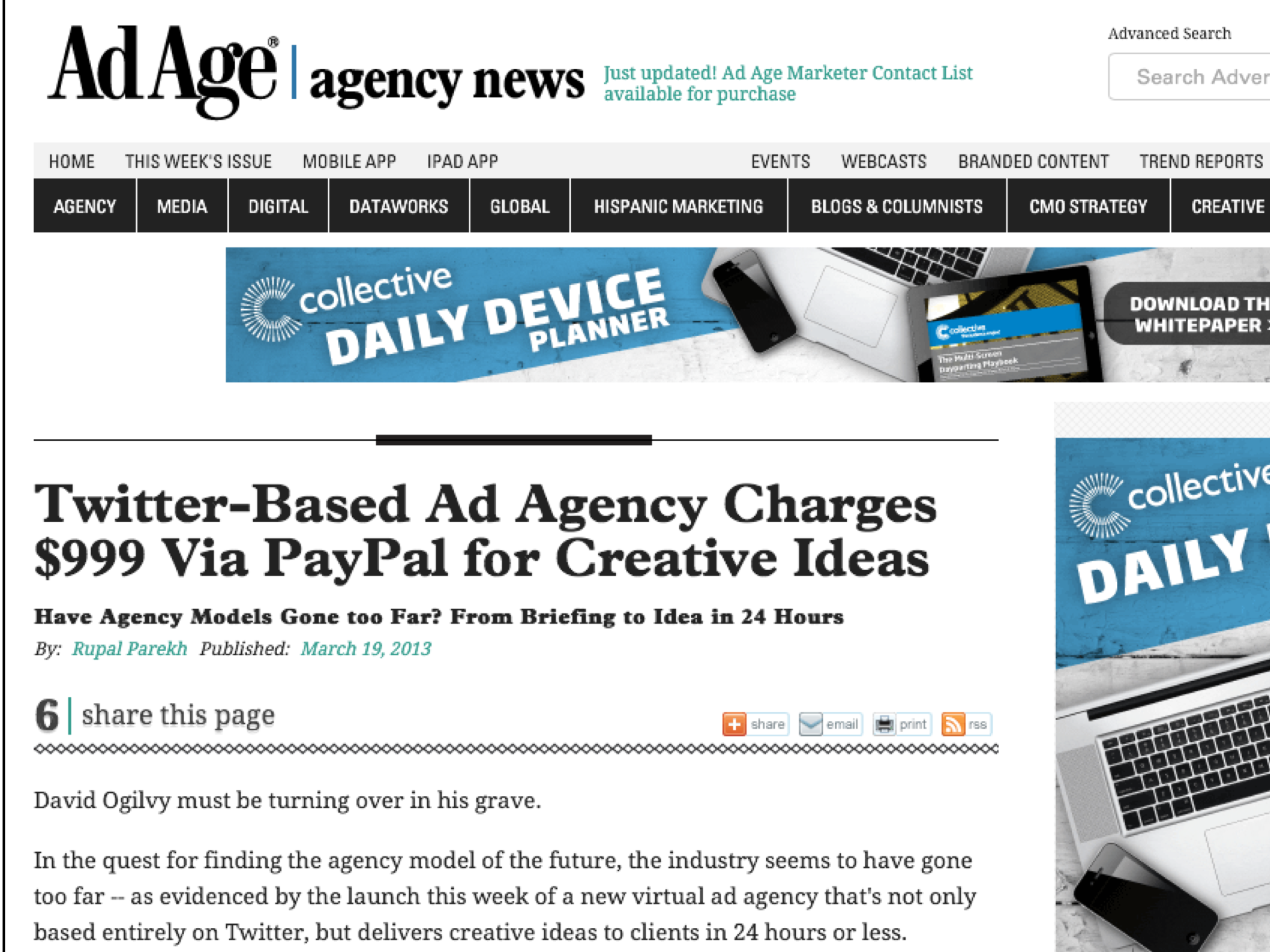
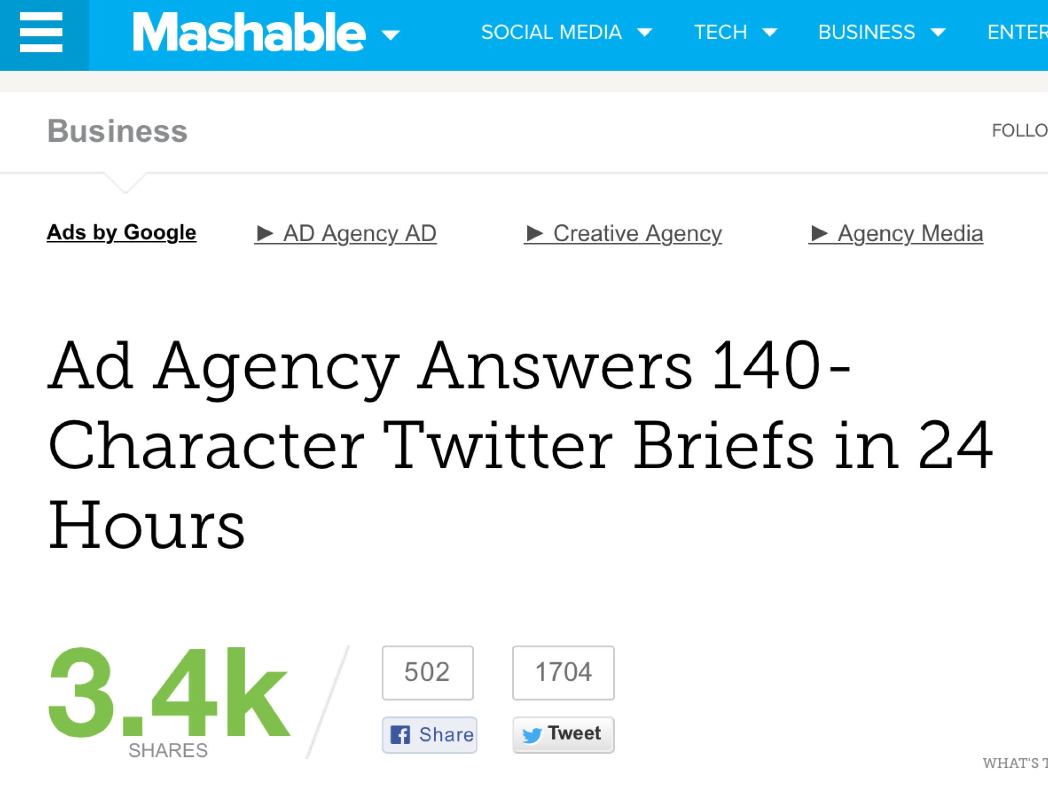
Twitter Campaign: @twipple Random Acts of Kindness

2
Live Installation: Dockers

2
Live Theatre/Guerrilla: British Airways

3
Sampling Experience: Tango Soda

2
Below-The-Line Campaign: Tubehell.com
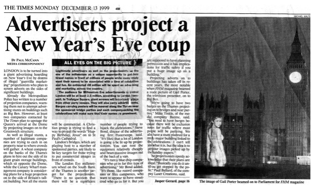
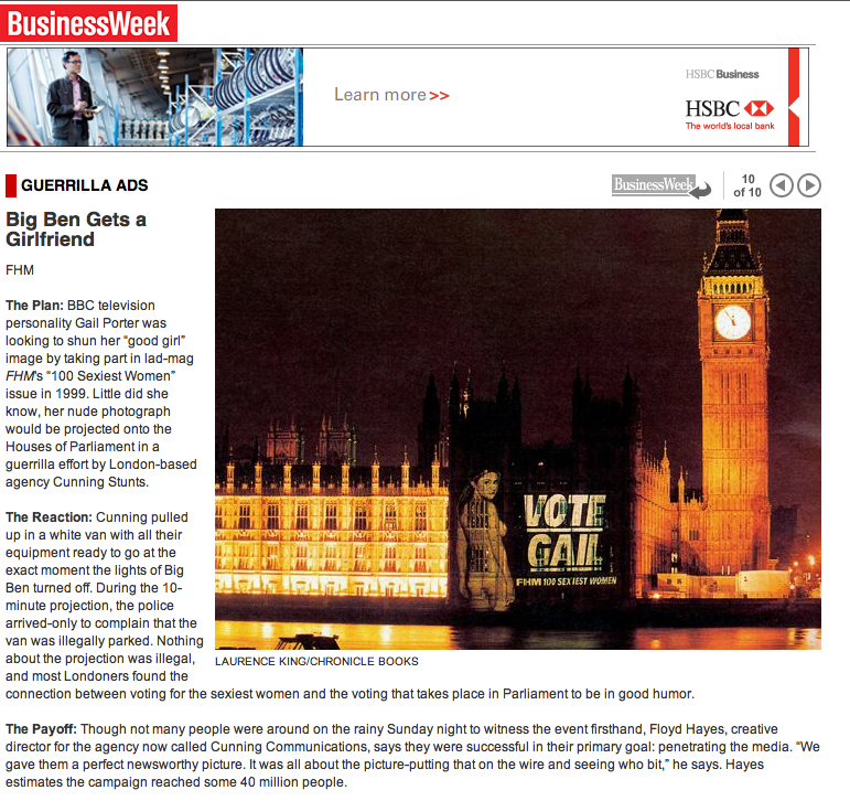
3
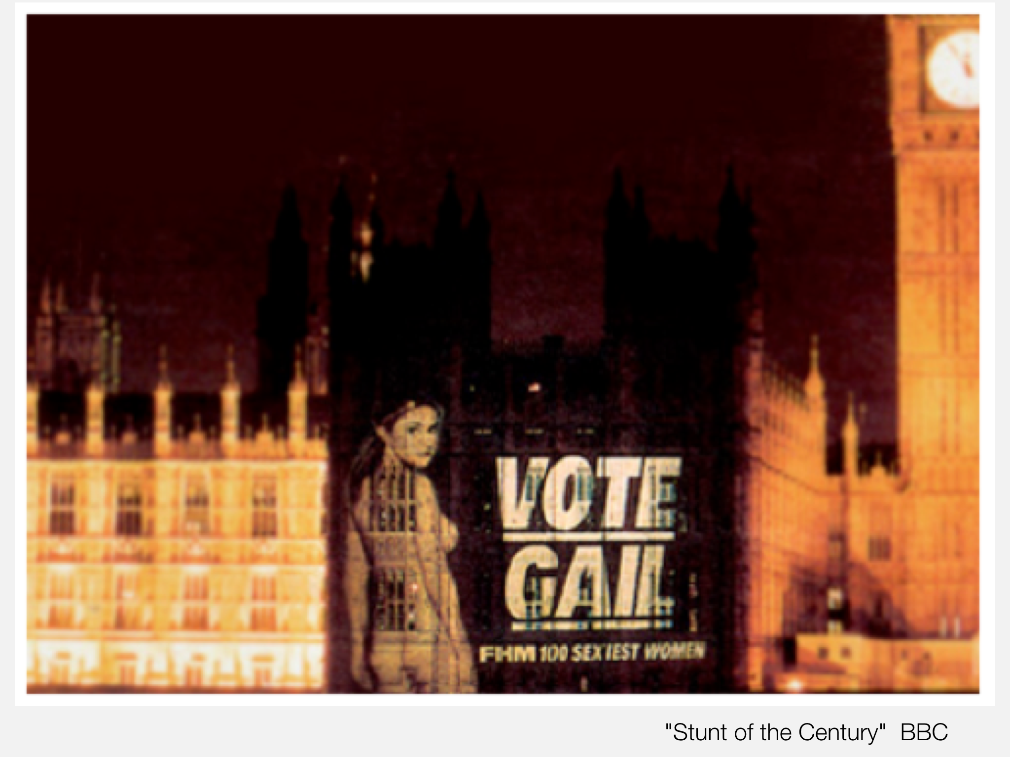
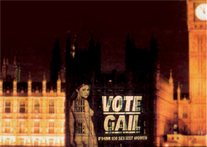
Guerrilla Stunt: FHM Projection

1
Live Digital Experience: Glastonbury's First Internet "Cafe"

4
Media First: 20th Century Fox

1
PR Stunts: World Records